Lima - MALI
Location: Lima,Peru
Type: Museum Competition
Structure: Steel Vierendeel Truss, Charred Cedar, Concrete Slurry Walls
Year: 2016
Team: Luiza Souza, Zachary Kile, Noor Al Awadhi, David Harrop, Francesca Carney, Rosanna Pitarresi
Infrastructural Thickness
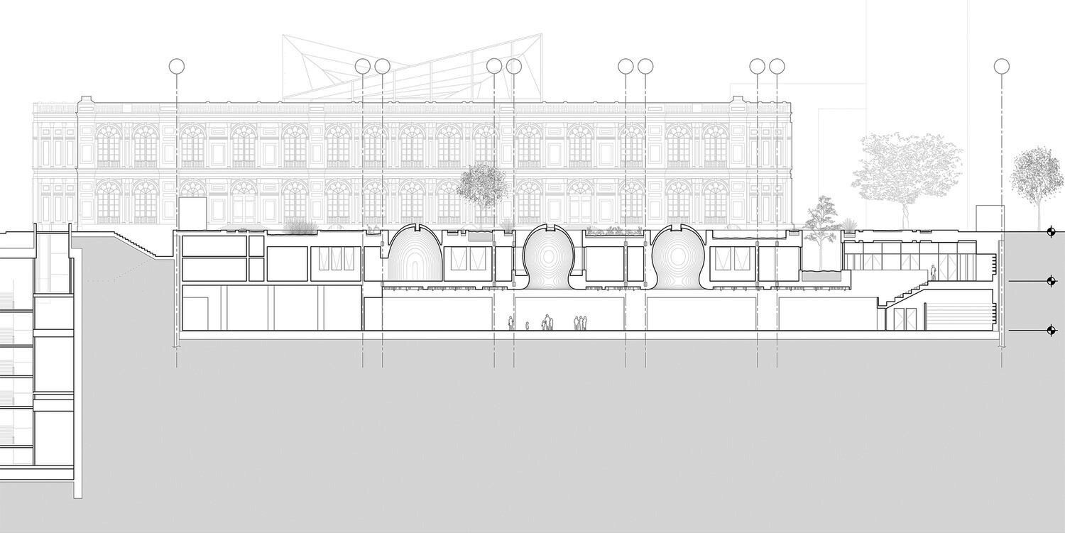
The Museum of Art Lima contemporary art wing expansion requested almost equal area for gallery and educational spaces. The competition brief also placed a height limit of one meter in order to ensure that the colonial neoclassical facade of the existing museum building would not be obscured. This height limit essentially required that the new building be completely underground. It was in response to this combination of programmatic equivalency between education/exhibition and the necessity to build underground that our proposal developed.
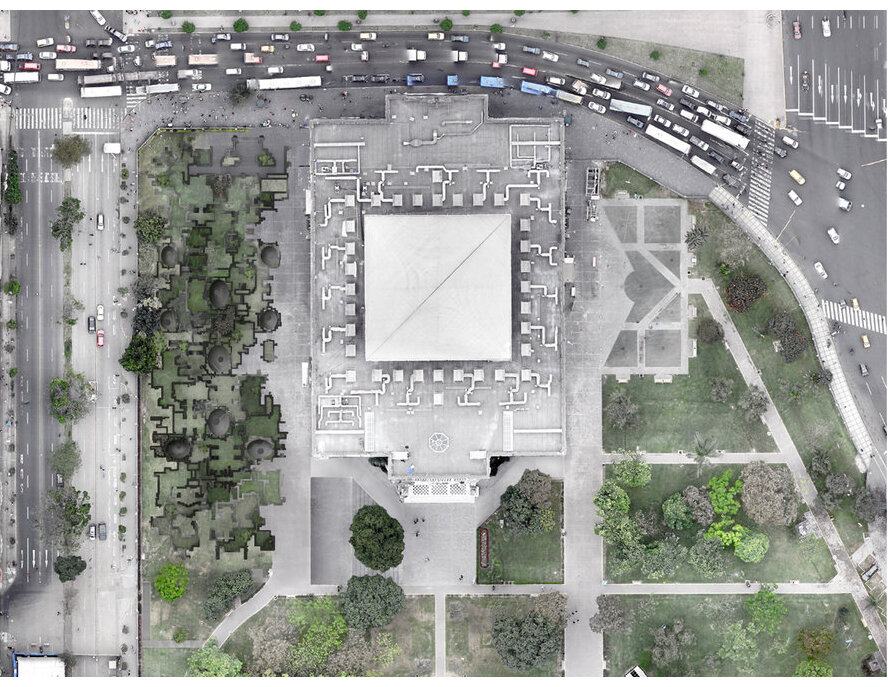
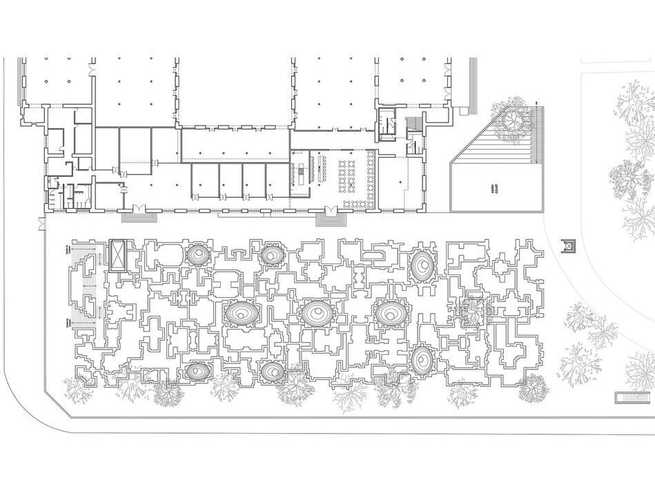
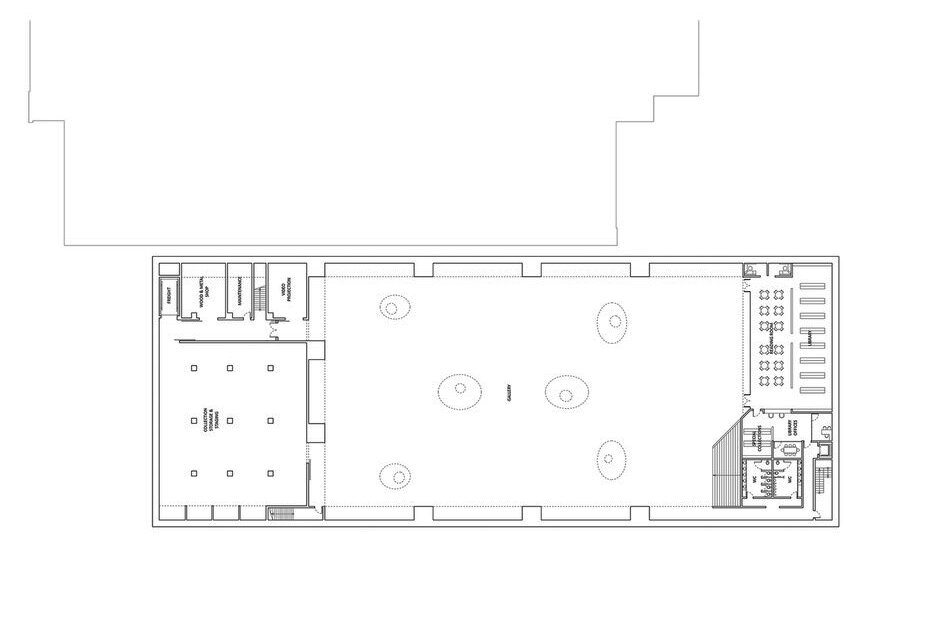
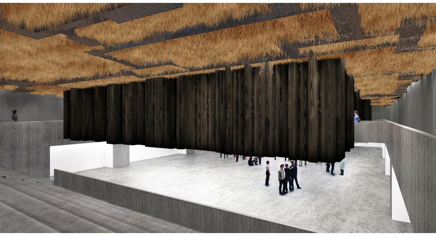
What we proposed was an artificial ground compacting all the infrastructure of services and program into one thickened poché, floated across the site on a series of paired Vierendeel trusses. This mass levitates above an entirely open gallery, an unobstructed plan available for multiple exhibition layouts. The traditional poché conceal the labor of services, be they human or non-human, within the hollow thickness of modern construction. In our design, this gap is the entire project, a fat hollow infrastructural ground/ceiling.
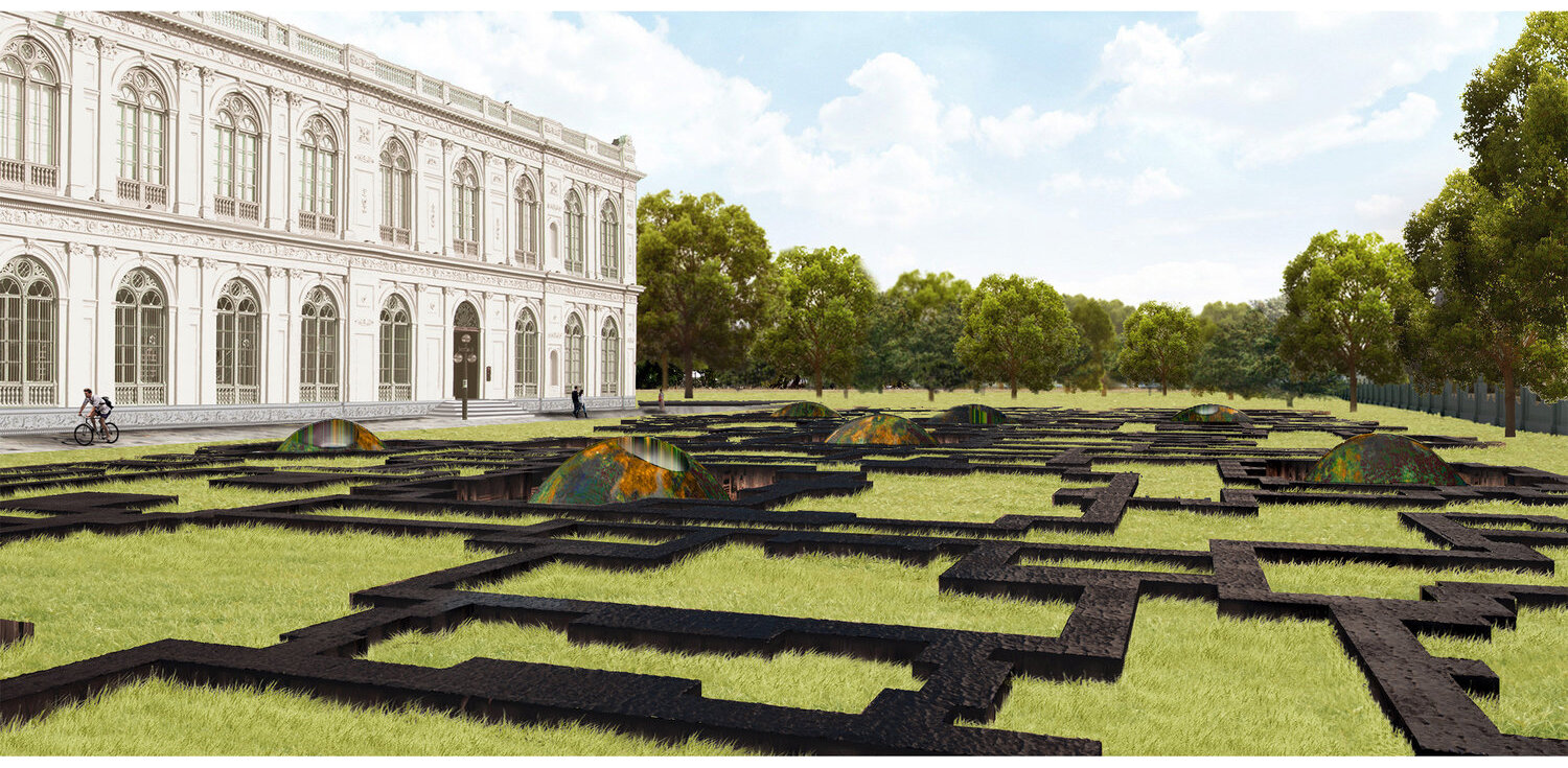
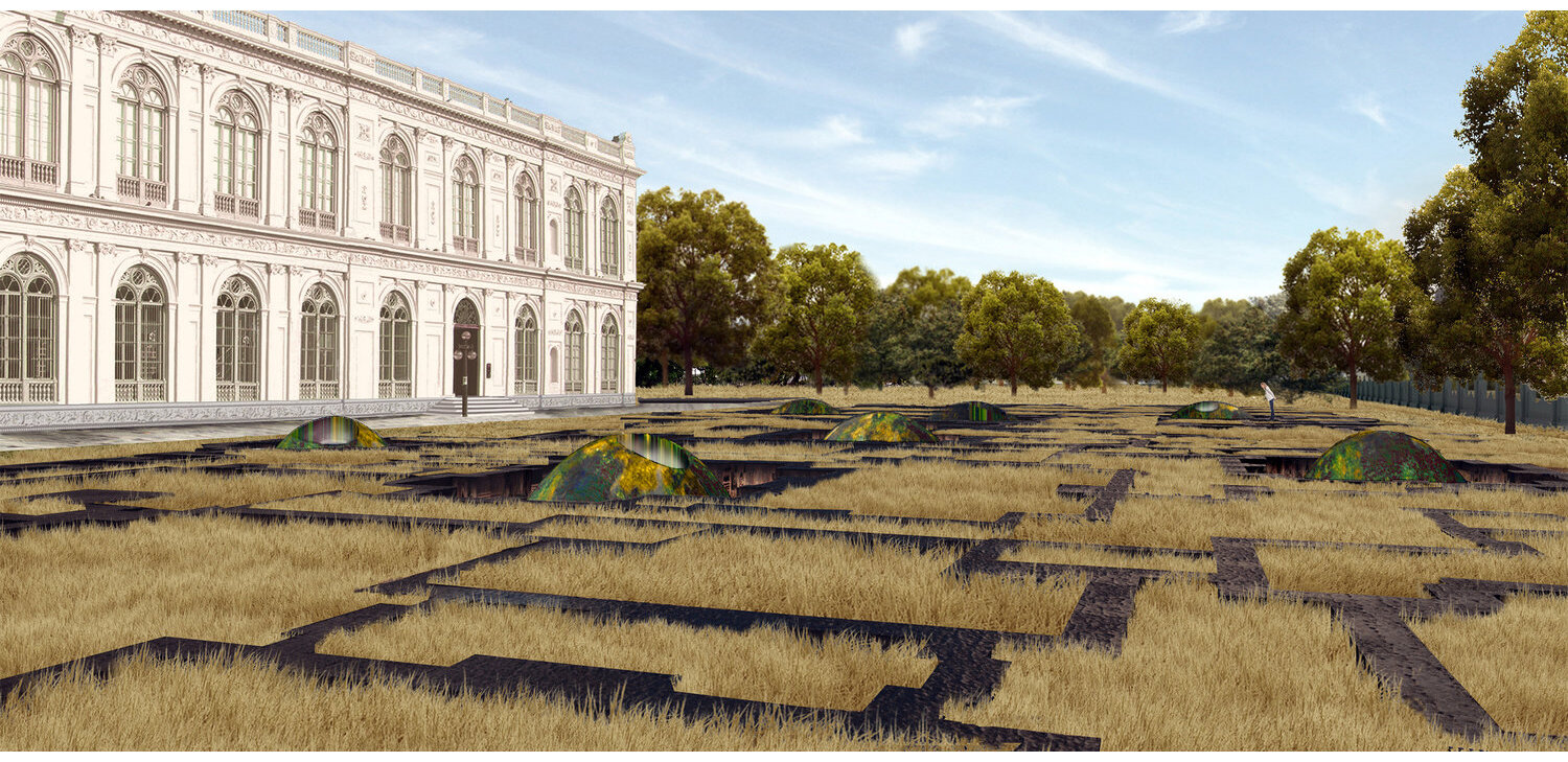
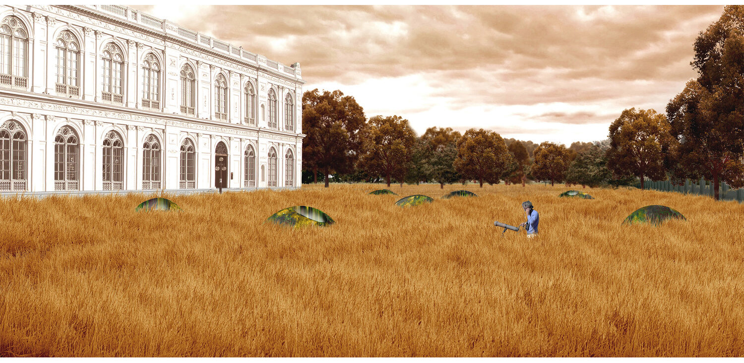
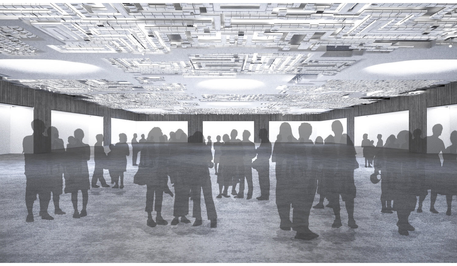
Above ground, the only “building” expression is of a maze of low walls. We likened these to foundations of an architecture yet to be built, or perhaps one from a remote past that had been demolished. These “foundations” are constructed of a charred cedar wood for weather, insect and fire protection and contain patches of wild grass which as it grows transforms ground divisions into foot paths navigating the site. This plan is organized around the idea of multiple local symmetries; an indecipherable, stuttering repetition that creates a labyrinthine circulation. Once the grass is fully grown, the only visible exterior objects are a series of rusting domes, which appear as potentially older than the existing buildings they serve. As one enters the building through a sunken court, the landscape inverts into an interior ceiling, creating the uncanny feeling of a building turned upside down. This is emphasized further upon moving into the lower gallery level, under the floating educational block. The gallery ceiling is entirely filled to an excessive absurdity with mechanical ducts that borders on decorative excess. The rusted domes protruding in the landscape are revealed as abstract light volumes within the technical system of the ceiling/floor/roof and providing spatial volumes through the poché towards the ground above.
© All content © Young & Ayata

